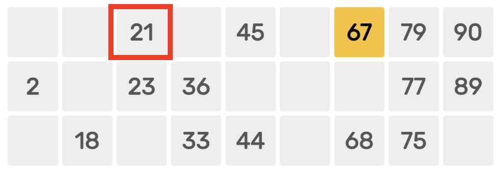
Just like CSS is used to style HTML page, Styled Components is one of the way to style React components. How we use Styled Components differs from normal CSS. Styled Components follow a CSS-in-JS approach.
This article is part of setting up a Tambola game. The learnings through the journey is documented in this blog.
Planning React Component
The goal is to create a React component that renders a single cell of a Tambola Card.

Here is the TambolaCell component.
const Tambolacell = (props) => {
  return (
    <Cell numberCalled={props.numberCalled}>
      <Helmet>
        <link rel="preconnect" href="https://fonts.googleapis.com" />
        <link rel="preconnect" href="https://fonts.gstatic.com" crossorigin />
        <link
          href="https://fonts.googleapis.com/css2?family=Rubik:wght@400;700&display=swap"
          rel="stylesheet"
        />
      </Helmet>
      12
    </Cell>
  );
};
The Cell component used is a Styled Component which we will see in the next section.
The component uses Rubik Google font. The reference to the font is added in <head> using react-helmet package.
Using Styled Component
We need to install styled-components. Then import it using:
import styled from "styled-components";We can then create a React component with style like this:
export const Cell = styled.div`
  background: ${(props) => (props.numberCalled ? "#ffbf00" : "#eee")};
  color: #333;
  font-size: 18px;
  font-family: "Rubik", sans-serif;

  display: flex;
  width: 38px;
  height: 38px;
  justify-content: center;
  align-items: center;

  border-radius: 3px;
`;
This is how the Cell component in previous section was created. The props we pass to Cell component can be read inside the component like:
background: ${(props) => (props.numberCalled ? "#ffbf00" : "#eee")};Output
Here we use the component with and without props.
<TambolaCell />
<br />
<TambolaCell numberCalled />
And here is the output:
